Dashboard Creation
UI
Dashboard Creation
Dashboard configuration is simple yet very powerful. Dashboards can be created in single files or made modular for reuse of blocks of widgets. Dashboards are configured using YAML.
We will start with a simple single-file configuration. Create a file
with a .dash extension in the dashboards directory, and pull it
up in your favorite editor.
Main Settings
A top-level dashboard will usually have one of several initial directives to configure aspects of the dashboard, although they are all optional. An example is as follows:
##
## Main arguments, all optional
##
title: Main Panel
widget_dimensions: [120, 120]
widget_size: [1, 1]
widget_margins: [5, 5]
columns: 8
global_parameters:
    use_comma: 0
    precision: 1
    use_hass_icon: 1
    namespace: default
    devices:
      media_player:
        step: 5
These are all fairly self-explanatory:
title- the name that will end up in the title of the web page, defaults to “HADashboard”.widget_dimensions- the unit height and width of the individual widgets in pixels. Note that the absolute size is not too important as on tablets at least the browser will scale the page to fit. What is more important is the aspect ratio of the widgets as this will affect whether or not the dashboard completely fills the tablet’s screen. The default is [120, 120] (width, height). This works well for a regular iPad.widget_size- the number of grid blocks each widget will be by default if not specifiedwidget_margins- the size of blank space between widgets.rows- the total number of rows in the dashboard. This will help with spacing, but is optional for dashboards with fewer than 15 rowscolumns- the number of columns the dashboard will have.scalable- if set toFalsethis parameter will disable resizing and double-tap zooming on iOS devices, default is not to disable zooming.global_parameters- a list of parameters that will be applied to every widget. If the widget does not accept that parameter, it will be ignored. Global parameters can be overridden at the widget definition if desired. This is useful for instance if you want to use commas as decimals for all of your widgets. This will also apply to widgets defined with just their entity ids so they will not require a formal widget definition just to change the decimal separator. The namespace parameter will be explained further in the namespace section of this document. Within theglobalparameters it is also possible to set parameters at the device level by including adeviceentry (see above for an example). Under device you can add an entry for any widget type, then under that, list global parameters that will be applied to just that widget type. For instance, in the example above, the default step size for all media players is set to 5% rather than the default 10%.
The very simplest dashboard needs a layout so it can understand where to
place the widgets. We use a layout directive to tell HADashboard how
to place them. Here is an example:
layout:
    - light.hall, light.living_room, input_boolean.heating
    - media_player(2x1), sensor.temperature
As you can see, here we are referring directly to native Home Assistant
entities. From this, HADashboard is able to figure out the right widget
type and grab its friendly name and add it to the dashboard. For the
clock and weather widgets there is no associated entity id so
just your clock.clock or weather.weather.
The layout command is intended to be visual in how you layout the widgets. Each layout entry represents a row on the dashboard; each comma-separated widget represents a cell on that row.
Widgets can also have a size associated with them - that is the
(2x1) directive appended to the name. This is simply the width of
the widget in columns and the height of the widget in rows. For
instance, (2x1) would refer to a widget 2 cells wide and 1 cell
high. If you leave of the sizing information, the widget will use the
widget_size dashboard parameter if specified, or default to
(1x1) if not. HADashboard will do its best to calculate the right
layout from what you give it but expect strange behavior if you add too
many widgets on a line.
For a better visual cue, you can lay the widgets out with appropriate spacing to see what the grid will look like more intuitively:
layout:
   - light.hall,       light.living_room, input_boolean.heating
   - media_player(2x1),                   sensor.temperature
… and so on.
Make sure that the number of widths specified adds up to the total number of columns, and don’t forget to take into account widgets that are more than one row high (e.g., the weather widget here).
If you want a blank space, you can use the special widget name
spacer. To leave a whole row empty, just leave an entry for it with
no text. For instance:
- light.hall, light.living_room, input_boolean.heating
-
- media_player(2x1), sensor.temperature
The above would leave the 2nd row empty. If you want more than one empty
line use empty as follows”:
- light.hall, light.living_room, input_boolean.heating
- empty: 2
- media_player(2x1), sensor.temperature
This would leave the 2nd and 3rd rows empty.
And that is all there to it, for a simple one file dashboard.
Detailed Widget Definition
The approach above is ok for simple widgets like lights, but HADashboard has a huge range of customization options. To access these, you need to define the widget along with its associated parameters formally.
To define a widget, simply add lines elsewhere in the file. Give it a name, a widget type and a number of optional parameters like this:
weather_widget:
    widget_type: weather
    units: "°F"
Here we have defined a widget of type “weather” and given it an optional parameter to tell it what units to use for temperature. Each widget type will have different required parameters, refer to the documentation below for a complete list for each type. All widgets support ways to customize colors and text sizes as well as attributes they need to understand how to link the widget to Home Assistant, such as entity_ids.
Lets look at a couple more examples of widget definitions:
andrew_presence:
    widget_type: device_tracker
    title: Andrew
    device: andrews_iphone

clock:
    widget_type: clock

garage:
    widget_type: switch
    title: Garage
    entity: switch.garage_door
    icon_on: fas-car
    icon_off: fas-car
    warn: 1

light_level:
    widget_type: sensor
    title: Light Level
    units: "lux"
    precision: 0
    shorten: 1
    entity: sensor.side_multisensor_luminance_25_3

mode:
    widget_type: sensor
    title: House Mode
    entity: input_select.house_mode

porch_motion:
    widget_type: binary_sensor
    title: Porch
    entity: binary_sensor.porch_multisensor_sensor_27_0

side_temperature:
    widget_type: sensor
    title: Temperature
    units: "°F"
    precision: 0
    entity: sensor.side_temp_corrected

side_humidity:
    widget_type: sensor
    title: Humidity
    units: "%"
    precision: 0
    entity: sensor.side_humidity_corrected

weather:
    widget_type: weather
    units: "°F"

wendy_presence:
    widget_type: device_tracker
    title: Wendy
    device: wendys_iphone
Now, instead of an entity id, we refer to the name of the widgets we just defined:
layout:
    - clock(2x1), weather(2x2), side_temperature(1x1), side_humidity(1x1), andrew_presence(1x1), wendy_presence(1x1)
    - mode(2x1), light_level(2x1), porch_motion(1x1), garage(1x1)
It is also possible to add a widget from a standalone file. The file
will contain a single widget definition. To create a clock widget this
way we would make a file called clock.yaml and place it in the
dashboard directory along with the dashboard. The contents would look
something like this:
widget_type: clock
widget_style: "color: red"
Note that the indentation level starts at 0. To include this file, just
reference a widget called clock in the layout, and HADashboard will
automatically load the widget.
A file will override a native entity so that you can create your dashboard
just using entities, but if you want to customize a specific entity, you
can just create a file named <entity_name>.yaml and put the settings
in there. You can also override entity names by specifying a widget of
that name in the same or any other file, which will take priority over a
standalone yaml file.
And that is all there to it, for a simple one file dashboard.
Advanced Dashboard Definition
When you get to the point where you have multiple dashboards, you may want to take a more modular approach. For example, you will find that in many cases, you want to reuse parts of other dashboards. For instance, I have a common header for mine consisting of a row or two of widgets I want to see on every dashboard. I also have a footer of controls to switch between dashboards that I want on each dashboard as well.
To facilitate this, it is possible to include additional files, inline
to build up dashboards in a more modular fashion. These additional files
end in .yaml to distinguish them from top-level dashboards. They can
contain additional widget definitions and also optionally their own
layouts.
The sub-files are included in the layout using a variation of the layout directive:
layout:
    - include: top_panel
This will look for a file called top_panel.yaml in the dashboards
directory, then include it. There are a couple of different ways this
can be used.
If the yaml file includes its own layouts directive, the widgets from that file will be placed as a block, in the way described by its layout, making it reusable. You can change the order of the blocks inclusion by moving wherein the original layout directive you include them.
If the yaml file just includes widget definitions, it is possible to perform the layout in the higher level dash if you prefer so you still get an overall view of the dashboard. This approach has the benefit that you can be completely flexible in the layout whereas the first method defines fixed layouts for the included blocks.
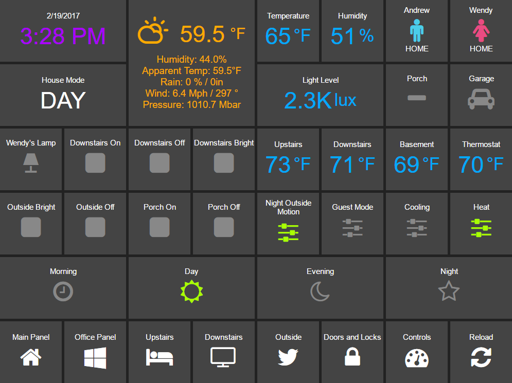
I prefer the completely modular approach - here is an example of a full top-level dashboard created in that way:
title: Main Panel
widget_dimensions: [120, 120]
widget_margins: [5, 5]
columns: 8

layout:
    - include: top_panel
    - include: main_middle_panel
    - include: mode_panel
    - include: bottom_panel
As you can see, it includes four modular sub-dashes. Since these pieces all have their own layout information there is no need for additional layout in the top-level file. Here is an example of one of the self contained submodules (mode_panel.yaml):
clock:
    widget_type: clock

weather:
    widget_type: weather
    units: "°F"

side_temperature:
    widget_type: sensor
    title: Temperature
    units: "°F"
    precision: 0
    entity: sensor.side_temp_corrected

side_humidity:
    widget_type: sensor
    title: Humidity
    units: "%"
    precision: 0
    entity: sensor.side_humidity_corrected

andrew_presence:
    widget_type: device_tracker
    title: Andrew
    device: andrews_iphone

wendy_presence:
    widget_type: device_tracker
    title: Wendy
    device: dedb5e711a24415baaae5cf8e880d852

mode:
    widget_type: sensor
    title: House Mode
    entity: input_select.house_mode

light_level:
    widget_type: sensor
    title: Light Level
    units: "lux"
    precision: 0
    shorten: 1
    entity: sensor.side_multisensor_luminance_25_3

porch_motion:
    widget_type: binary_sensor
    title: Porch
    entity: binary_sensor.porch_multisensor_sensor_27_0

garage:
    widget_type: switch
    title: Garage
    entity: switch.garage_door
    icon_on: fas-car
    icon_off: fas-car
    warn: 1

layout:
    - clock(2x1), weather(2x2), side_temperature, side_humidity, andrew_presence, wendy_presence
    - mode(2x1), light_level(2x1), porch_motion, garage
Now if we take a look at that same layout, but assume that just the widget definitions are in the sub-blocks, we would end up with something like this - note that we must explicitly lay out each widget we have included in the other files:
title: Main Panel
widget_dimensions: [120, 120]
widget_margins: [5, 5]
columns: 8

layout:
    - include: top_panel
    - include: main_middle_panel
    - include: mode_panel
    - include: bottom_panel
    - clock(2x1), weather(2x2), side_temperature, side_humidity, andrew_presence, wendy_presence
    - mode(2x1), light_level(2x1), porch_motion, garage
    - wlamp_scene, don_scene, doff_scene, dbright_scene, upstairs_thermometer, downstairs_thermometer, basement_thermometer, thermostat_setpoint
    - obright_scene, ooff_scene, pon_scene, poff_scene, night_motion, guest_mode, cooling, heat
    - morning(2x1), day(2x1), evening(2x1), night(2x1)
    - load_main_panel, load_upstairs_panel, load_upstairs, load_downstairs, load_outside, load_doors, load_controls, reload
In this case, the actual layout including a widget must be after the include as you might expect.
A few caveats for loaded subfiles:
Sub files can include other subfiles to a maximum depth of 10 - please avoid circular references!
When layout information is included in a subfile, the subfile must comprise 1 or more complete dashboard rows - partial rows or blocks are not supported.
As a final option, you can create widget definitions in the main file and use them in the layout of the header/footer/etc. For example, if you have a header that has a label on it that lists the room that the dashboard is associated with, you can put the label widget definition in the header file but all the pages get the same message. If you put the label widget definition in the main file for the room, and reference it from the layout in the header, each page has the right name displayed in the header.
For example:
clock:
    widget_type: clock
layout:
    - label(2x2),clock(2x2)
In this example of a header, we reference a clock and a label in the layout. We can reuse this header, but in order to make the label change for every page we use it on we actually define it in the dashboard file itself, and include the header in the layout:
title: Den Panel
widget_dimensions: [120, 120]
widget_margins: [5, 5]
columns: 8

label:
    widget_type: label
    text: Welcome to the Den

layout:
    - include: header
Widget Customization
Widgets allow customization using arbitrary CSS styles for the individual
elements that make up the widget. Every widget has a
widget_style argument to apply styles to the whole widget, as
well as one or more additional style arguments that differ for each
widget. To customize a widget background, for instance:
clock:
  widget_type: clock
  widget_style: "background: white;"
As is usual with CSS you can feed it multiple parameters at once, e.g.:
clock:
  widget_type: clock
  widget_style: "background: white; font-size: 150%;"
You can use any valid CSS style here although you should probably steer away from some of the formatting types as they may interact badly with HADashboards formatting. Widget level styles will correctly override just the style in the skin they are replacing.
In the case of the clock widget, it also supports date_style and
time_style to modify those elements accordingly:
clock:
  widget_type: clock
  widget_style: "background: white"
  date_style: "color: black"
  time_style: "color: green"
Since date_style and time_style are applied to more specific
elements, they will override widget_style. Also note that some
widget styles may be specified in the widget’s CSS, in which case that
style will override widget_style but not the more specific styles.
State and state text
Some widgets allow you to display not only an icon showing the state but also text of the state itself. The following widgets allow this:
scene
binary_sensor
icon
switch
device_tracker
script
lock
cover
input_boolean
In order to enable this, just add:
state_text: 1
to the widget definition. This will then make the widget show the HA state below the icon. Since native HA state is not always very pretty, it is also possible to map this to better values, for instance in a different language than English.
To add a state map, just add a state_map list to the widget definition listing the HA states and what you actually want to be displayed. For instance:
state_map:
  "on": Aan
  "off": Uit
One wrinkle here is that YAML over-enthusiastically “helps” by
interpreting things like on and off as booleans so the quotes
are needed to prevent this.
Titles
Each widget could have custom text for title a title2. You can use the option to force the widget to use text from entity friendly name attribute.
title_is_friendly_name- set title as entity friendly name if existstitle2_is_friendly_name- set title2 as entity friendly name if exists
Example:
title_is_friendly_name: 1
title2_is_friendly_name: 1
Icons
Widgets that allow the specification of icons have access to both Font
Awesome and Material
Design Icons. To specify an icon
simply use the prefix mdi- for Material Design, and the appropriate style prefix for Font Awesome Icons.
icon_on: fas-bell
icon_off: mdi-cancel
In addition, the widget can be configured to use whatever icon is defined for it in Home Assistant by setting the parameter:
use_hass_icon: 1
This can also be set at the dashboard level as a global parameter.
External Commands
The dashboard can accept commands from external systems to prompt actions, such as navigation to different pages. These can be achieved through a variety of means:
AppDaemon API Calls
HASS Automations/Scripts
Alexa Intents
The mechanism used for this is HASS custom events. AppDaemon has its own
API calls to handle these events, for further details see the
AppDaemon API Pages. The custom event name is ad_dashboard and the
dashboard will respond to various commands with associated data.
To create a suitable custom event within a HASS automation, script or Alexa Intent, simply define the event and associated data as follows (this is a script example):
alias: Navigate
sequence:
- event: ad_dashboard
  event_data:
    command: navigate
    timeout: 10
    target: SensorPanel
    sticky: 0
These following arguments are optional and can be used to determine if a given device or dashboard should execute the command or not:
deviceid: If set, only the device(s) which has the same deviceid will
execute the command. See below how to set a deviceid.
dashid: If set, all devices currently on a dashboard which the title
contains the substring defined by dashid will execute the command. ex: if
dashid is set to “kichen”, it will match devices which are on “kitchen lights”,
“kitchen sensors”, “ipad - kitchen”, etc.
Setting a deviceid
A “device” is a combination of machine+browser, so a computer+firefox could
be one device, while the same computer+safari can be another. To set the
deviceid of a device add the `deviceid=your_deviceid` parameter to
the dashboard url, for instance:
http://192.168.1.20:5050/mypanel?deviceid=kitchentablet
HADashboard will try to store the deviceid on the device so you don’t need to use this parameter every time. You may use it again if you want to set a new deviceid or if you cleaned device’s cookies or the device doesn’t support it.
The current list of commands supported and associated arguments are as follows:
Namespaces
For a full explanation of namespaces see the Writing AppDaemon Apps Section of the guide. Namespaces may be ignored in HADashboard if only one plugin is in use.
If multiple namespaces are in use, HADashboard is able to specify either at the dashboard level or the widget level which namespace to use. This is achieved by use of the namespace parameter. This parameter may be specified for each individual widget if desired. If it is specified as one of the global parameters, it will apply to all widgets but may be overridden for individual widgets. If not specified as a global parameter, the default namespace will be used for any widgets that do not override it. For example:
##
## Main arguments, all optional
##
title: Main Panel
widget_dimensions: [120, 120]
widget_size: [1, 1]
widget_margins: [5, 5]
columns: 8
global_parameters:
    use_comma: 0
    precision: 1
    use_hass_icon: 1
    # Not setting namespace here so the default namespace is used

# Clock has no namespace
clock:
    widget_type: clock

# side_temperature doesn't specify a namespace so will use the default
# If we specified a different namespace in the global options it would use that instead
side_temperature:
    widget_type: sensor
    title: Temperature
    units: "°F"
    precision: 0
    entity: sensor.side_temp_corrected

# side_humidity overrides the default and uses the hass2 namespace
# It will use hass2 regardless of any global setting
side_humidity:
    namespace: hass2
    widget_type: sensor
    title: Humidity
    units: "%"
    precision: 0
    entity: sensor.side_humidity_corrected
One caveat to namespaces is that the RSS widget always works with the admin namespace - since the RSS feeds are supplied by AppDaemon itself, and not one of the plugins.
Widget Reference
Here is the current list of widgets and their description and supported parameters:
alarm
A widget to report on the state of an alarm and allow code entry
Mandatory Arguments:
entity- the entity_id of the alarm to be monitored
Optional Arguments:
title- the title displayed on the tiletitle2- a second line of title text
Style Arguments:
widget_styletitle_styletitle2_stylestate_stylepanel_state_stylepanel_code_stylepanel_background_stylepanel_button_style
binary_sensor
A widget to monitor a binary_sensor
Mandatory arguments:
entity- the entity_id of the binary_sensor
Optional Arguments:
title- the title displayed on the tiletitle2- a second line of title textstate_textstate_map
Style Arguments:
icon_onicon_offwidget_styleicon_style_activeicon_style_inactivetitle_styletitle2_stylestate_text_style
camera
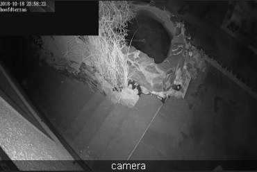
A widget to display a refreshing camera image on the dashboard.
Mandatory arguments:
entitythe entity_id of the camerabase_urlthe URL to your Home Assistant install. If you wish to access your dashboard from an external network, then this needs to be the external URL to Home Assistant.
Optional Arguments:
refresh(seconds) - if set, the camera image will refresh every interval. Use 0 to indicate no refresh at all. Default is 10 seconds for non-streaming cameras and 0 for streaming cameras.stream- If set to on live data will be streamed to the dashboard instead of needing to be refreshed.
Style Arguments:
widget_styletitle_style
heater
A widget to control a heater or fan
Mandatory arguments:
icon_entity- the entity_id of the switch functionslider_entity- the entity_id of the input_number
Optional Arguments:
title - the title displayed on the tile title2 - a second line of title text
Style Arguments:
title_styletitle2_styleslider_stylewidget_styleicon_style_activeicon_style_inactive
climate
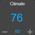
A widget to monitor and control a climate entity
Mandatory arguments:
entity- the entity_id of the climate entity
Optional Arguments:
title- the title displayed on the tiletitle2- a second line of title textstep- the size of step in temperature when fading the slider up or downunits- the unit symbol to be displayedprecision- the number of digits to display after the decimal point
Style Arguments:
widget_styleicon_upicon_downtitle_styletitle2_stylelevel_stylelevel2_styleunit_styleunit2_stylelevel_up_stylelevel_down_style
clock
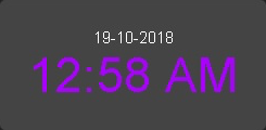
A simple 12 hour clock with the date. Not currently very customizable but it will be improved upon.
Mandatory arguments:
None
Optional Arguments:
time_format- set to “24hr” if you want military time/24 hour clockshow_seconds- set to 1 if you want to see seconds on the displaydate_format_country- Format the clock in the style of a specific country. This can take a simple value likeusor more complex parameters as described here.date_format_options- if usingdate_format_countryyou can also add additional options for formatting as described here.. For example:
clock:
    widget_type: clock
    date_format_country: "ro"
    date_format_options:
      weekday: "short"
      day: "numeric"
      month: "numeric"
Style Arguments:
widget_styletime_styledate_style
cover
A widget to monitor and activate a cover. At this time only the open and close actions are supported.
Mandatory arguments:
entity- the entity_id of the cover
Optional Arguments:
title- the title displayed on the tiletitle2- a second line of title textstate_textstate_map
Style Arguments:
icon_onicon_offwidget_styleicon_style_activeicon_style_inactivetitle_styletitle2_style
device_tracker
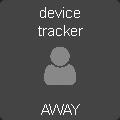
A Widget that reports on device tracker status. It can also be optionally be used to toggle the status between “home” and “not_home”.
Mandatory Arguments:
device- name of the device fromknown_devices.yaml, not the entity_id.
Optional Arguments:
title- the title displayed on the tiletitle2- a second line of title textenable- set to 1 to enable the widget to toggle the device_tracker statusstate_textstate_mapactive_map
Active map is used to specify states other than “home” that will be regarded as active, meaning the icon will light up. This can be useful if tracking a device tracker within the house using beacons for instance.
Example:
wendy_presence_mapped:
  widget_type: device_tracker
  title: Wendy
  title2: Mapped
  device: wendys_iphone
  active_map:
    - home
    - house
    - back_yard
    - upstairs
In the absence of an active map, only the state home will be
regarded as active.
Style Arguments:
icon_onicon_offwidget_styleicon_style_activeicon_style_inactivetitle_styletitle2_stylestate_text_style
entitypicture
A widget to display entity picture
Mandatory arguments:
entity- the entity to display entity_picture attribute
Optional Arguments:
title- the title displayed on the tile.base_url- URL to prepend before content of entity_picture.
Example:
entitypicture1:
    widget_type: entitypicture
    title: Weather by YR
    entity: sensor.yr_symbol
Example showing artwork of just playing an album on media player: (tested with Google Home)
entitypicture2:
    widget_type: entitypicture
    entity: media_player.bedroom
    base_url: https://my_domain.duckdns.org:8123
    image_style: "top: 0; bottom: 0; left: 0; right: 0;"
Style Arguments:
widget_styletitle_styleimage_style
fan
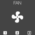
A widget to monitor and control a fan. it uses by default low, medium and high for the 3 possible settings, that can be changed if needed. (for example for a fan that has 5 speeds)
Mandatory arguments:
entity- the entity_id of the fan
Optional Arguments:
title- the title displayed on the tile.low_speed- the speed the entity uses for low.medium_speed- the speed the entity uses for medium.high_speed- the speed the entity uses for high.
Example:
fan1:
      widget_type: fan
      entity: fan.fan1
      title: "FAN1"
Style Arguments:
widget_styletitle_stylecontainer_styleicon_style_activeicon_style_inactivespeed1_icon_style_activespeed1_icon_style_inactivespeed2_icon_style_activespeed2_icon_style_inactivespeed3_icon_style_activespeed3_icon_style_inactiveicon_onicon_offspeed1_icon_onspeed1_icon_offspeed2_icon_onspeed2_icon_offspeed3_icon_onspeed3_icon_off
gauge
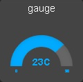
A widget to report on numeric values for sensors in Home Assistant in a gauge format.
The gauge can optionally accept 3 style colors. These must be in hex RGB format, and the graph will interpolate the color of the level bar in between them. For example:
gauge:
  widget_type: gauge
  entity: sensor.processor_use
  title: gauge
  max: 400
  min: 0
  low_color: "#ff0000"
  medium_color: "#00ff00"
  high_color: "#0000ff"
  units: "%"
Mandatory Arguments:
entity- the entity_id of the sensor to be monitoredmax- maximum value to showmin- minimum value to show
Optional Arguments:
title- the title displayed on the tiletitle2- a second line of title textunits- the unit symbol to be displayed, if not specified HAs unit will be used, specify “” for no units
Style Arguments:
widget_styletitle_styletitle2_stylelow_colormed_colorhigh_colorbgcolorcolor
Note that unlike other widgets, the color settings require an actual color, rather than a CSS style.
group
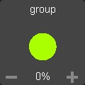
A widget to monitor and control a group of lights
Mandatory arguments:
entity- the entity_id of the group
Optional Arguments:
title- the title displayed on the tiletitle2- a second line of title textmonitored_entity- the actual entity to monitor
Groups currently do no report back state changes correctly when
attributes light brightness are changed. As a workaround, instead of
looking for state changes in the group, we use monitored_entity
instead. This is not necessary of there are no dimmable lights in the
group; however, if there are, it should be set to the entity_id of one
of the dimmable group members.
Style Arguments:
widget_styleicon_onicon_officon_upicon_downtitle_styletitle2_styleicon_style_activeicon_style_inactivetext_stylelevel_stylelevel_up_stylelevel_down_style
icon
A widget to monitor the state of an entity and display a different icon and style for each listed state, and is configured in a similar manner to the following:
icon:
  title: icon
  widget_type: icon
  entity: binary_sensor.basement_door_sensor
  state_text: 1
  icons:
    "active":
      icon: fas-glass
      style: "color: green"
      post_service_active:
        service: homeassistant/turn_on
        entity_id: script.deactivate
    "inactive":
      icon: fas-repeat
      style: "color: blue"
      post_service_active:
        service: homeassistant/turn_on
        entity_id: script.activate
    "idle":
      icon: fas-frown
      style: "color: red"
    "default":
      icon: fas-rocket
      style: "color: cyan"
The icons list is mandatory, and each entry must contain both an icon and a style entry. It is recommended that quotes are used around the state names, as without these, YAML will translate states like on and off to true and false.
Each icon can have a service call assigned by post_service_active entry - on icon click, specified service like HA script or AD sequence is called for currently active state.
The default entry icon and style will be used if the state doesn’t match any in the list - meaning that it is not necessary to define all states if only 1 or 2 actually matter.
Mandatory arguments:
entity- the entity_id of the binary_sensoricons- a list of icons, styles and service calls to be applied for various states
Optional Arguments:
title- the title displayed on the tiletitle2- a second line of title textstate_textstate_mapupdate_delay- seconds to wait before processing state update
Style Arguments:
widget_styletitle_styletitle2_stylestate_text_style
iframe
A widget to display other content within the dashboard
Mandatory arguments:
url_list- a list of 1 or more URLs to cycle though. orimg_list- a list of 1 or more Image URLs to cycle through.
Optional Arguments:
title- the title displayed on the tilerefresh- (seconds) if set, the iframe widget will progress down its list every refresh period, returning to the beginning when it hits the end. Use this in conjunction with a single entry in theurl_listto have a single url refresh at a set interval.
For regular HTTP sites, use the url_list argument, for images the
img_list argument should work better.
Example:
iframe:
    widget_type: iframe
    title: Cats
    refresh: 60
    url_list:
      - https://www.pexels.com/photo/grey-and-white-short-fur-cat-104827/
      - https://www.pexels.com/photo/eyes-cat-coach-sofas-96938/
      - https://www.pexels.com/photo/silver-tabby-cat-lying-on-brown-wooden-surface-126407/
      - https://www.pexels.com/photo/kitten-cat-rush-lucky-cat-45170/
      - https://www.pexels.com/photo/grey-fur-kitten-127028/
      - https://www.pexels.com/photo/cat-whiskers-kitty-tabby-20787/
      - https://www.pexels.com/photo/cat-sleeping-62640/
Content will be shown with scroll bars, which can be undesirable. For images this can be alleviated by using an image resizing service such as the one offered by Google.
weather_frame:
    widget_type: iframe
    title: Radar
    refresh: 300
    frame_style: ""
    img_list:
      - https://images1-focus-opensocial.googleusercontent.com/gadgets/proxy?url=https://icons.wxug.com/data/weather-maps/radar/united-states/hartford-connecticut-region-current-radar-animation.gif&container=focus&refresh=240&resize_h=640&resize_h=640
      - https://images1-focus-opensocial.googleusercontent.com/gadgets/proxy?url=https://icons.wxug.com/data/weather-maps/radar/united-states/bakersfield-california-region-current-radar.gif&container=focus&refresh=240&resize_h=640&resize_h=640
Style Arguments:
widget_styletitle_style
input_boolean
A widget to monitor and activate an input_boolean
Mandatory arguments:
entity- the entity_id of the input_boolean
Optional Arguments:
title- the title displayed on the tiletitle2- a second line of title textstate_textstate_map
Style Arguments:
icon_onicon_offwidget_styleicon_style_activeicon_style_inactivetitle_styletitle2_style
input_datetime
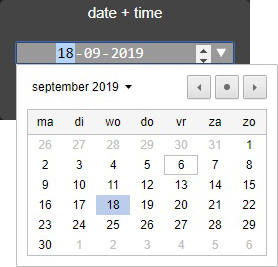
A widget to monitor and control an input_datetime
Mandatory arguments:
entity- the entity_id of the input_datetime
Optional Arguments:
title- the title displayed on the tiletitle2- a second line of title text
Style Arguments:
widget_styletitle_styletitle2_stylecontainer_styledate_styletime_style
input_number
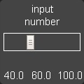
A widget to monitor and control an input_number
Mandatory arguments:
entity- the entity_id of the input_number
Optional Arguments:
title- the title displayed on the tiletitle2- a second line of title textunits- the unit symbol to be displayeduse_comma- if set to one, a comma will be used as the decimal separator
Style Arguments:
title_styletitle2_styleminvalue_stylemaxvalue_stylevalue_styleslider_styleslidercontainer_stylewidget_style
input_select
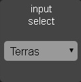
A widget to display and select values from an input_select entity in Home Assistant.
Mandatory Arguments:
entity- the entity_id of the sensor to be monitored
Optional Arguments:
title- the title displayed on the tiletitle2- a second line of title text
Style Arguments:
widget_styletitle_styletitle2_styleselect_styleselectcontainer_style
input_slider
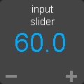
An alternate widget to monitor and control an input number, using plus and minus buttons instead of a slider.
Mandatory arguments:
entity- the entity_id of the input_number
Optional Arguments:
title- the title displayed on the tiletitle2- a second line of title textunits- the unit symbol to be displayeduse_comma- if set to one, a comma will be used as the decimal separator
Style Arguments:
title_styletitle2_styleminvalue_stylemaxvalue_stylevalue_styleslider_styleslidercontainer_stylewidget_style
input_text
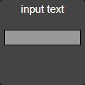
A widget to monitor and control an input_text
Mandatory arguments:
entity- the entity_id of the input_text
Optional Arguments:
title- the title displayed on the tiletitle2- a second line of title text
Style Arguments:
widget_styletitle_styletitle2_stylecontainer_styletext_style
javascript
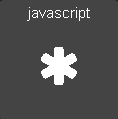
A widget to run an arbitrary JavaScript command.
Mandatory arguments:
command- the JavaScript command to be run.
e.g.
command: "alert('hello');"
Optional Arguments:
title- the title displayed on the tiletitle2- a second line of title text
Style Arguments:
icon_activeicon_inactivewidget_styletitle_styletitle2_styleicon_active_styleicon_inactive_style
label

A widget to show a simple static text string
Mandatory arguments:
None
Optional Arguments:
title- the title displayed on the tiletitle2- a second line of title texttext- the text displayed on the tile
Style Arguments:
widget_styletitle_styletitle2_stylevalue_style- changes the style from the text
light
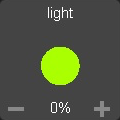
A widget to monitor and control a dimmable light
Mandatory arguments:
entity- the entity_id of the light
Optional Arguments:
icon_onicon_offtitle- the title displayed on the tiletitle2- a second line of title texton_attributes- a list of supported HA attributes to set as initial values for the light.
Note that rgb_color and xy_color are not specified with list
syntax as in Home Assistant scenes. See below for examples.
testlight2:
    widget_type: light
    entity: light.office_2
    title: office_2
    on_attributes:
        brightness: 100
        color_temp: 250
or:
testlight2:
    widget_type: light
    entity: light.office_2
    title: office_2
    on_attributes:
        brightness: 100
        rgb_color: 128, 34, 56
or:
testlight2:
    widget_type: light
    entity: light.office_2
    title: office_2
    on_attributes:
        brightness: 100
        xy_color: 0.4, 0.9
Style Arguments:
widget_styleicon_onicon_officon_upicon_downtitle_styletitle2_styleicon_style_activeicon_style_inactivetext_stylelevel_stylelevel_up_stylelevel_down_style
lock
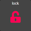
A widget to monitor and activate a lock
Note that unlike HASS, Dashboard regards an unlocked lock as active. By contrast, the HASS UI shows a locked lock as “on”. Since the purpose of the dashboard is to alert at a glance on anything that is unusual, I chose to make the unlocked state “active” which means in the default skin it is shown as red, whereas a locked icon is shown as gray. You can easily change this behavior by setting active and inactive styles if you prefer.
Mandatory arguments:
entity- the entity_id of the lock
Optional Arguments:
title- the title displayed on the tiletitle2- a second line of title textstate_textstate_map
Style Arguments:
icon_onicon_offwidget_styleicon_style_activeicon_style_inactivetitle_styletitle2_style
london_underground
A widget to report on the status of a London Underground line and provide the reason for delays if there are any. Requires the London Underground sensor to be configured in Home Assistant. This widget is designed to be a 2x2 tile.
It is recommended to update the background style to reflect the color of the underground line. An example would be as follows:
widget_style: "background-color: #0098D4"
The colors of the various lines are: - Bakerloo: #B36305 - Central: #E32017 - Circle: #FFD300 - District: #00782A - DLR: #00A4A7 - Hammersmith & City: #F3A9BB - Jubilee: #A0A5A9 - London Overground: #EE7C0E - Metropolitan: #9B0056 - Northern: #000000 - Piccadilly: #003688 - Victoria: #0098D4 - Waterloo & City: #95CDBA
For smaller dashboards the Description text can be too long to fit in the widget properly. In that case, hide the text as follows:
state_text_style: "display: none"
Mandatory arguments:
entity- the entity to be monitored
Optional Arguments:
title- the title displayed on the tile
Style Arguments:
state_text_styletext_styletitle_stylewidget_style
media_player
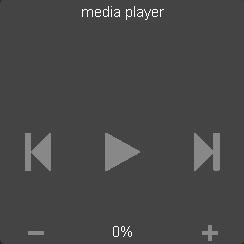
A widget to monitor and control a media player
Mandatory arguments:
entity- the entity_id of the media player
Optional Arguments:
title- the title displayed on the tiletitle2- a second line of title texttruncate_name- if specified, the name of the media will be truncated to this length.step- the step (in percent) that the volume buttons will use. (default, 10%)
Style Arguments:
widget_styleicon_onicon_officon_upicon_downtitle_styletitle2_styleicon_style_activeicon_style_inactivetext_stylelevel_stylelevel_up_stylelevel_down_style
mode
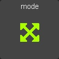
A widget to track the state of an input_select by showing active
when it is set to a specific value. Also allows scripts to be run when
activated.
Mandatory arguments:
entity- the entity_id of theinput_selectmode- value of the input select to show as activescript- script to run when pressedstate_textstate_map
Optional Arguments:
title- the title displayed on the tiletitle2- a second line of title text
Style Arguments:
icon_onicon_offwidget_styleicon_style_activeicon_style_inactivetitle_styletitle2_style
navigate
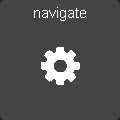
A widget to navigate to a new URL, intended to be used for switching between dashboards.
Mandatory arguments:
None, but either url or dashboard must be specified.
Optional Arguments:
url- a url to navigate to. Use a full URL including the http:// or https:// part.dashboard- a dashboard to navigate to e.g.MainPaneltitle- the title displayed on the tileargs- a list of arguments.skin- Skin to use with the new screen (for HADash URLs only)forward_parameters- a list of URL parameters that should be forwarded from the current dashboard URL to the next dashboard. For example, if the current dashboard was called with “&deviceid=1234&otherparameter=foo”, adding “deviceid” toforward_parameterswill preserve “deviceid” and discard “otherparameter=foo”. You may add “all” to theforward_parametersto forward all parameters, except “timeout”, “return”, “sticky” as this can cause problems. Ifforward_parametersis not used, then only skin is preserved.
For an arbitrary URL, Args can be anything. When specifying a dashboard parameter, args have the following meaning:
timeout- length of time to stay on the new dashboardreturn- dashboard to return to after the timeout has elapsed.sticky- whether or not to return to the original dashboard after it has been clicked on. The default behavior (sticky=0) is to remain on the new dashboard if clicked and return to the original otherwise. Withsticky=1`, clicking the dashboard will extend the amount of time, but it will return to the original dashboard after a period of inactivity equal totimeout.
If timeout is specified but return not, the widget will use the current dashboard as the return target.
If adding arguments, use the args variable. Do not append them to the URL or you may break skinning. Add arguments like this:
some_widget:
    widget_type: navigate
    title: Amazon
    url: http://amazon.com
    args:
      arg1: fred
      arg2: jim
or:
some_widget:
    widget_type: navigate
    title: Sensors
    dashboard: Sensors
    args:
      timeout: 10
      return: Main
Style Arguments:
icon_activeicon_inactivewidget_styletitle_styletitle2_styleicon_active_styleicon_inactive_style
person
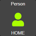
A Widget that reports on the status of a person. It can also be optionally be used to toggle the status between “home” and “not_home”.
Mandatory Arguments:
entity- entity of the person, e.g.person.andrew.
Optional Arguments:
title- the title displayed on the tiletitle2- a second line of title textenable- set to 1 to enable the widget to toggle the person statusstate_textstate_mapactive_map
Active map is used to specify states other than “home” that will be regarded as active, meaning the icon will light up. This can be useful if tracking a device tracker within the house using beacons for instance.
Example:
wendy_presence_mapped:
  widget_type: person
  title: Wendy
  title2: Mapped
  entity: person.wendy
  active_map:
    - home
    - house
    - back_yard
    - upstairs
In the absence of an active map, only the state home will be
regarded as active.
Style Arguments:
icon_onicon_offwidget_styleicon_style_activeicon_style_inactivetitle_styletitle2_stylestate_text_style
pirateweather
Up to date weather reports. By default, it’s configured to work with pirateweather
sensors. To use all the features, you need to add these sensors to the
Monitored conditions option in the configuration for the Home Assistant
Pirate Weather integration:
Icon
Precipitation Type
Precipitation Intensity
Precipitation Probability
Temperature
Apparent Temperature
Humidity
Wind Speed
Wind Bearing
Pressure
To have the forecast displayed set show_forecast to 1. For it to work you
additionally need to add 1 to the Daily forecasts sensors option in the configuration
for the Home Assistant Pirate Weather integration. To use all the forecast features, you
need to add these sensors to monitored_conditions:
Temperature High
Temperature Low
forecast:
  - 1
Mandatory arguments:
None
Optional Arguments:
titleshow_forecast- show the forecastprefer_icons- use icons instead of textforecast_title- title of the forecast if enabledsensors- list of sensors used by the widget
You can change the entities used by the widget by overwriting their values
in the sensors key in configuration.
Example with default values:
sample_weather:
  widget_type: weather
  title: Today
  show_forecast: 1
  prefer_icons: 1
  forecast_title: Tomorrow
  sensors:
    icon: sensor.pirateweather_icon
    temperature: sensor.pirateweather_temperature
    apparent_temperature: sensor.pirateweather_apparent_temperature
    humidity: sensor.pirateweather_humidity
    precip_probability: sensor.pirateweather_precip_probability
    precip_intensity: sensor.pirateweather_precip_intensity
    precip_type: sensor.pirateweather_precip
    pressure: sensor.pirateweather_pressure
    wind_speed: sensor.pirateweather_wind_speed
    wind_bearing: sensor.pirateweather_wind_bearing
    forecast_icon: sensor.pirateweather_icon_1
    forecast_temperature_min: sensor.pirateweather_daily_low_temperature_1
    forecast_temperature_max: sensor.pirateweather_daily_high_temperature_1
    forecast_precip_probability: sensor.pirateweather_precip_probability_1
    forecast_precip_type: sensor.pirateweather_precip_1
Style Arguments:
widget_stylemain_styleunit_stylesub_stylesub_unit_styletitle_style
radial
A widget to display a numeric value as a gauge
Mandatory Arguments:
entity- the entity_id of the alarm to be monitoredsettings- a list if values describing the gauge with the following entries:title - title of the gauge
minValue - minimum value to display
maxValue - maximum value to display
majorTicks - Where to mark major values, a list
highlights - color ranges, a list
See the example below:
your_radial:
  widget_type: radial
  entity: sensor.your_sensor
  settings:
    title: any title
    minValue: 0
    maxValue: 100
    majorTicks: [0,20,40,60,80,100]
    highlights: [{'from': 0, 'to': 18, 'color': 'rgba(0,0, 255, .3)'},{'from': 25, 'to': 100, 'color': 'rgba(255, 0, 0, .3)'}]
Optional Arguments:
None
Style Arguments:
None
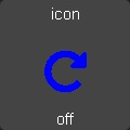
reload
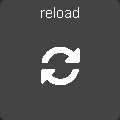
A widget to reload the current dashboard.
Mandatory arguments:
None.
Optional Arguments:
title- the title displayed on the tiletitle2- a second line of title text
Style Arguments:
icon_activeicon_inactivewidget_styletitle_styletitle2_styleicon_active_styleicon_inactive_style
rss
A widget to display an RSS feed.
Note that the actual feeds are configured in appdaemon.yaml as follows:
hadashboard:

  rss_feeds:
    - feed: <feed_url>
      target: <target_name>
    - feed: <feed url>
      target: <target_name>

      ...

  rss_update: <feed_refresh_interval>
feed_url- fully qualified path to rss feed, e.g.,http://rss.cnn.com/rss/cnn_topstories.rsstarget name- the entity of the target RSS widget in the dashboard definition file. This must be an arbitrary name prepended byrss.- e.g.,rss.cnn_newsfeed_refresh_interval- how often AppDaemon will refresh the RSS feeds
There is no limit to the number of feeds you configure, and you will need to configure one RSS widget to display each feed.
Mandatory Arguments:
entity- the name of the configured feed - this must match thetarget_namefull target name configured in the AppDaemon configuration e.g. rss.cnn_newsinterval- the period between display of different items within the feed
Optional Arguments:
title- the title displayed on the tiletitle2- a second line of title textrecent- the number of most recent stories that will be shown. If not specified, all stories in the feed will be shown.show_description- if set to1the widget will show a short description of the story as well as the title. Default is0
Style Arguments:
widget_styletitle_styletitle2_styletext_style
scene
A widget to activate a scene
Mandatory arguments:
entity- the entity_id of the scene
Optional Arguments:
title- the title displayed on the tiletitle2- a second line of title textstate_textstate_map
Style Arguments:
icon_onicon_offwidget_styleicon_style_activeicon_style_inactivetitle_styletitle2_style
script
A widget to run a script
Mandatory arguments:
entity- the entity_id of the script
Optional Arguments:
title- the title displayed on the tiletitle2- a second line of title textstate_textstate_mapenabled- if set to 0 the switch can’t be pressed but only shows statusmomentary- after the set amount of milliseconds the old state returns (momentary button)
Style Arguments:
icon_onicon_offwidget_styleicon_style_activeicon_style_inactivetitle_styletitle2_style
sequence
A widget to run a sequence
Mandatory arguments:
entity- the entity_id of the sequence e.g.sequence.office_on
Optional Arguments:
title- the title displayed on the tiletitle2- a second line of title textstate_textstate_map
Style Arguments:
icon_onicon_offwidget_styleicon_style_activeicon_style_inactivetitle_styletitle2_style
sensor
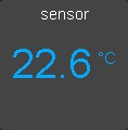
A widget to report on values for any sensor in Home Assistant
The widget will detect whether or not it is showing a numeric value, and if so, it will use the numeric style. If it is showing text, it will use the text style, which among other things makes the text size smaller. To display an attribute of a sensor rather than the state itself add the attribute to the end of the sensor name. For example, to display the description of the sensor.dark_sky_summary sensor you would use the following entity definition: “sensor.dark_sky_summary.Description”.
Note that you can define a sub_entity to be an attribute of the entity using the entity_to_sub_entity_attribute argument, or an entity as an attribute of the sub_entity using the sub_entity_to_entity_attribute.
Mandatory Arguments:
entity- the entity_id of the sensor to be monitored
Or
sub_entity- the entity_id of the sensor to be monitored
Optional Arguments:
title- the title displayed on the tiletitle2- a second line of title textunits- the unit symbol to be displayed, if not specified HAs unit will be used, specify “” for no unitsprecision- the number of decimal placesshorten- if set to one, the widget will abbreviate the readout for high numbers, e.g.1.1Kinstead of1100use_comma- if set to one, a comma will be used as the decimal separatorstate_mapsub_entity- second entity to be displayed in the state text areasub_entity_map- state map for the sub_entityentity_to_sub_entity_attribute- the attribute of the entity to use as the sub_entitysub_entity_to_entity_attribute- the attribute of the sub_entity to use as the entity
Style Arguments:
widget_styletitle_styletitle2_stylevalue_styletext_styleunit_stylecontainer_stylestate_text_style(used for styling ofsub_entity)
switch
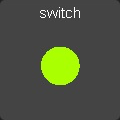
A widget to monitor and activate a switch
Mandatory arguments:
entity- the entity_id of the switch
Optional Arguments:
title- the title displayed on the tiletitle2- a second line of title textstate_textstate_mapenabled- if set to 0 the switch can’t be pressed but only shows statusmomentary- after the set amount of milliseconds the old state returns (momentary button)
Style Arguments:
icon_onicon_offwidget_styleicon_style_activeicon_style_inactivetitle_styletitle2_style
temperature
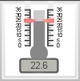
A widget to report display a temperature using a thermometer style view
Mandatory Arguments:
entity- the entity_id of the alarm to be monitoredsettings- a list if values describing the thermometer with the following entries:minValue - minimum value to display
maxValue - maximum value to display
width - width of the widget, set this to the same width as your cell size or less
height - height of the widget, set this to the same height as your cell size or less
majorTicks - Where to mark major values, a list
highlights - color ranges, a list
See the example below:
your_temperature:
  widget_type: temperature
  entity: sensor.your_sensor
  settings:
    minValue: 15
    maxValue: 30
    width: 120
    height: 120
    majorTicks: [15,20,25,30]
    highlights: [{'from': 15, 'to': 18, 'color': 'rgba(0,0, 255, .3)'},{'from': 24, 'to': 30, 'color': 'rgba(255, 0, 0, .3)'}]
Optional Arguments:
None
Style Arguments:
None
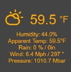
weather
Up to date weather reports. By default, it’s configured to work with dark sky sensor. To use all the features, you need to add these sensors to monitored_conditions:
temperature
apparent_temperature
humidity
precip_probability
precip_intensity
precip_type
wind_speed
wind_bearing
pressure
icon
To have the forecast displayed set show_forecast to 1. For it to work you
additionally need to add the forecast option in dark_sky Home Assistant
configuration:
forecast:
  - 1
To use all the forecast features, you need to add these sensors to monitored_conditions:
temperature_low
temperature_high
Forecasts (1 day in the future) can be displayed for the weather icon, min and max temperature, precipitation probability and precipitation type.
Mandatory arguments:
None
Optional Arguments:
titleshow_forecast- show the forecastprefer_icons- use icons instead of textforecast_title- title of the forecast if enabledsensors- list of sensors used by the widget
You can change the entities used by the widget by overwriting their values
in the sensors key in configuration.
Example with default values plus wind forecast:
sample_weather:
  widget_type: weather
  title: Today
  show_forecast: 1
  prefer_icons: 1
  forecast_title: Tomorrow
  sensors:
    icon: sensor.dark_sky_icon
    temperature: sensor.dark_sky_temperature
    apparent_temperature: sensor.dark_sky_apparent_temperature
    humidity: sensor.dark_sky_humidity
    precip_probability: sensor.dark_sky_precip_probability
    precip_intensity: sensor.dark_sky_precip_intensity
    precip_type: sensor.dark_sky_precip
    pressure: sensor.dark_sky_pressure
    wind_speed: sensor.dark_sky_wind_speed
    wind_bearing: sensor.dark_sky_wind_bearing
    forecast_icon: sensor.dark_sky_icon_1
    forecast_temperature_min: sensor.dark_sky_daily_low_temperature_1
    forecast_temperature_max: sensor.dark_sky_daily_high_temperature_1
    forecast_precip_probability: sensor.dark_sky_precip_probability_1
    forecast_precip_type: sensor.dark_sky_precip_1
Style Arguments:
widget_stylemain_styleunit_stylesub_stylesub_unit_styletitle_style
weather_summary
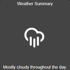
An icon and summary reflecting the weather forecast. Requires dark sky to be configured in Home Assistant and expects to be used with one of the following sensors:
sensor.dark_sky_daily_summary
sensor.dark_sky_hourly_summary
sensor.dark_sky_summary
Mandatory arguments:
entity- the entity to be monitored
Optional Arguments:
title- the title displayed on the tile
Style Arguments:
state_text_styletext_styletitle_stylewidget_style
Skins
HADashboard fully supports skinning and ships with a number of skins. To
access a specific skin, append the parameter skin=<skin name> to the
dashboard URL. Skin names are sticky if you use the Navigate widget to
switch between dashboards and will stay in force until another skin or
no skin is specified.
HADashboard currently has the following skins available:
default - the classic HADashboard skin, very simple
obsidian, contributed by
@rpiterazen, contributed by
@rpiterasimplyred, contributed by
@rpiteraglassic, contributed by
@rpitera
Skin development
HADashboard fully supports customization through skinning. It ships with a number of skins courtesy of @rpitera, and we encourage users to create new skins and contribute them back to the project.
To create a custom skin you will need to know a little bit of CSS. Start
off by creating a directory called custom_css in the configuration
directory, at the same level as your dashboards directory. Next, create
a subdirectory in custom_css named for your skin.
The skin itself consists of 2 separate files:
dashboard.css- This is the base dashboard CSS that sets the widget styles, background, look and feel, etc.variables.yaml- This is a list of variables that describe how different elements of the widgets will look. Using the correct variables you can skin pretty much every element of every widget type.
Dashboard.css is a regular CSS file, and knowledge of CSS is required to make changes to it.
Variables.yaml is really a set of override styles, so you can use
fragments of CSS here, basically, anything that you could normally put in
an HTML style tag. Variables .yaml also supports variable expansion
to make structuring the file easier. Anything that starts with a $
is treated as a variable that refers back to one of the other yaml
fields in the file.
Here is an example of a piece of a variables.yaml file:
##
## Styles
##

white: "#fff"
red: "#ff0055"
green: "#aaff00"
blue: "#00aaff"
purple: "#aa00ff"
yellow: "#ffff00"
orange: "#ffaa00"

gray_dark: "#444"
gray_medium: "#666"
gray_light: "#888"

##Page and widget defaults
background_style: ""
text_style: ""

##These are used for icons and indicators
style_inactive: "color: $gray_light"
style_active: "color: gold"
style_active_warn: "color: gold"
style_info: "color: gold; font-weight: 500; font-size: 250%"
style_title: "color: gold; font-weight: 900"
style_title2: "color: $white"
Here we are setting up some general variables that we can reuse for styling the actual widgets.
Below, we are setting styles for a specific widget, the light widget. All entries are required but can be left blank by using double-quotes.
light_icon_on: fas-circle
light_icon_off: fas-circle-thin
light_icon_up: fas-plus
light_icon_down: fas-minus
light_title_style: $style_title
light_title2_style: $style_title2
light_icon_style_active: $style_active
light_icon_style_inactive: $style_inactive
light_state_text_style: $white
light_level_style: "color: $gray_light"
light_level_up_style: "color: $gray_light"
light_level_down_style: "color: $gray_light"
light_widget_style: ""
Images can be included - create a sub directory in your skin directory,
call it img or whatever you like, then refer to it in the css as:
/custom_css/<skin name>/<image directory>/<image filename>
One final feature is the ability to include additional files in the header and body of the page if required. This can be useful to allow additional CSS from 3rd parties or include JavaScript.
Custom head includes - should be a YAML List inside variables.yaml,
e.g.:
head_includes:
  - some include
  - some other include
Text will be included verbatim in the head section of the doc, use for styles, javascript or 3rd party CSS, etc. etc. It is your responsibility to ensure the HTML is correct
Similarly, for body includes:
body_includes:
  - some include
  - some other include
To learn more about complete styles, take a look at the supplied styles
to see how they are put together. Start off with the dashboard.css
and variables.yaml from an existing file and edit to suit your
needs.
Javascript
There are a lot of ways to use javascript in Dashboard. You can create custom widgets that will need javascript, use the javascript widget to trigger a javascript function or you can add javascript directly to the head includes or body includes.
Custom widgets require their own special .js files, but to trigger a function
from the javascript widget or from the body includes you can create a
custom_javascript directory in the configuration directory.
All files that are placed in that directory will automatically included in
Dashboard.
All functions you place in a .js file inside that directory will be
available everywhere in dashboard.
Remember that you do this on your own responsibility. javascript code in
those files can break Dashboards, and create vulnerabilities.
Example Dashboards
Some example dashboards are available in the AppDaemon repository:
A Note on Font Awesome Upgrade
As of AppDaemon 3.0.2, Font Awesome icons have been upgraded from version 4 to version 5. FA Introduced a lot of breaking changes with this upgrade. While all of HADashboard’s included skins have been updated to reflect this, any custom skins may need changes, as will any custom icons used within dashboard config files. FA have provided a table of changed icons here.
To ease the transition further, a legacy mode has been included in HADashboard. This is not enabled by default, but can be turned on by specifying the following in the hadashboard section of appdaemon.cfg:
fa4compatibility: 1
This is not intended as a permanent fix and may be removed at some point, but for now, this will enable existing skins and icons to work correctly, giving you an opportunity to work through your configurations and fix things.
While working through the upgrade, it is strongly advised that you clear your browser cache and force recompile all of your dashboards to flush out references to old icons. This can be done by manually removing the compiled subdirectory in conf_dir, specifying recompile=1 in the arguments to the dashboard, or setting the hadashboard option dash_compile_on_start to 1.